
Usability of Responsive Web Design
NBTY Europe put Holland & Barrett’s new responsive Web Design through its paces

Holland and Barrett is Europe’s leading health and wellbeing retailer with over 600 stores nationwide and a significant online presence. Key to Holland and Barrett’s proposition is the knowledge of its staff, which is achieved through one of the most extensive staff-training programmes in the retail industry. This is translated to the online experience through a substantial knowledge base that can be accessed on the website.
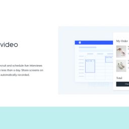
NBTY Europe, Holland and Barrett’s parent company, recognised that traffic from customers using mobile devices was rising and that the channel would be of increasing importance for revenue and customer interactions. To support this and future growth a new website was planned using responsive web design (RWD), an approach that allows the same website to be used on devices ranging of different screen sizes from smartphone, desktop and beyond. RWD would allow Holland and Barrett customers to benefit from the familiarity of the same website, whatever device they accessed it from.
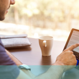
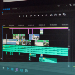
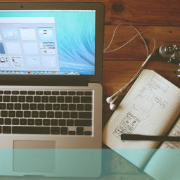
Recognising the inherent challenges of delivering a great experience across so many different screen sizes, NBTY Europe brought in UX24/7 to carry out multiplatform usability testing prior to launch. The usability testing, carried out with both existing and potential customers, would encompass the key platforms of smartphone, tablet and Desktop/Laptop. A viewing facility was used to allow key members of the NBTY Europe team to view the usability test sessions and specialist technology captured picture in picture video sessions of screen and participant on all platforms.
We carried out usability testing and increased the participant numbers to allow for testing on three platforms. We used picture in picture video capture technology for all platforms and included videos with our final report
QUICK FACTS
- Usability testing using real participants in a usability lab
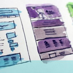
- Prototype website using a responsive web design
- Multi-platform testing on PC. Tablet & Smartphone
- Actionable Recommendations
The results showed that the major processes (browse, search, add to basket and buy) performed well and that on the whole the experience on all platforms was good. However, there were challenges with the smartphone experience due to the amount of scrolling involved to get at key content. This came as no surprise to the NBTY team who recognised that using responsive web design is not just about resizing of content, it also requires a customer centric approach to content order.
The findings from the usability test provided by UX 24/7 identified various options for improving the smartphone experience in particular, and for removing some of the “friction” that existed across all platforms. Gareth Walbyoff, eCommerce Manager for NBTY Europe commented, “Usability is very important to us and so it was imperative that we gained deep insight about how the website was working in a multiplatform environment. UX24/7 really understand responsive web design and we were delighted to have multiplatform specialists on the project”. Such is NBTY Europe’s commitment to customers that further usability work is planned as is a beta-launch to the Holland and Barrett customer panel before the new website will go live.
“UX24/7 really understand responsive web design and we were delighted to have multiplatform specialists on the project”
Gareth Walbyoff
eCommerce Manager for NBTY Europe


