
Internet traffic from tablets and smartphones recently surpassed traffic from traditional computers, so it should come as no surprise that smartphone design is playing an increasingly significant role on website usability. Smaller screen sizes demanded a simplified, smoother, and more accessible browsing experience, and it turns out this is also exactly what desktop and laptop users prefer as well.
Here are some of the ways smartphone design has influenced website usability today:
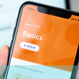
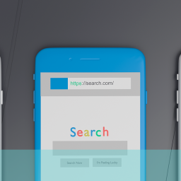
Flat Design
Picture your computer’s address book; or your iPhone’s calendar; or your iPad’s newstand. All of these things are manufactured to appear just like their real life counterparts. Yet do we really need all of these visual prompts and additional details? Advocators of flat design certainly don’t think so.
Opting to eschew a vast myriad of gradients, shadows and textures that even the biggest smartphone screen would struggle to render, flat design leaves behind an outdated and over cluttered style in favor of a more simple aesthetic approach that is proving increasingly popular. Moving towards clean layouts, solid colours and precise typography, flat design champions the functionality and clean aesthetic required of mobile browsing.
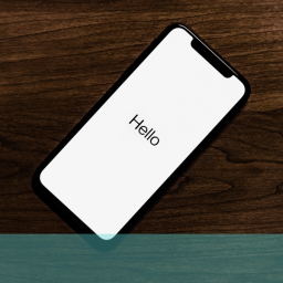
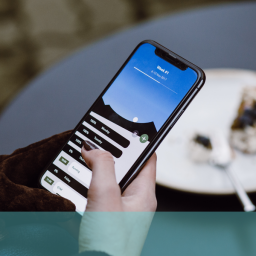
Large Typography
In keeping with flat design, big typefaces gel with the general shift towards the simplification of website usability. They are sleek, bold and beautiful, easier to view on smaller screens, and compliment the trend towards clear headlines, vivid branding and succinctly delivered information. Demanding attention, they can be artistically appealing and bypass the need for slow loading images, photos and illustrations.
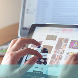
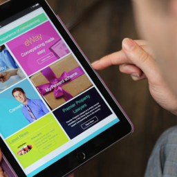
Grid Layouts
Popularised by the success of the Windows mobile operating system and websites like Pinterest, using grid-like systems to order web content has proven to be an effective method of increasing website usability. Particularly useful for responsive websites, the tile layout is entirely flexible, making it incredibly simple to alter the user experience of a website no matter what device content is viewed on.=
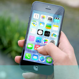
Simplistic Icons
The internet is becoming a lot less text-heavy as of late, with many apps and websites having almost no visible text, relying instead on icons and images alone to convey information to the user. Offbeat visual elements are aesthetically pleasing, quickly grasped and simplify navigation. They also break up tediously long bodies of text, providing the user with a brief, visually appealing reprieve. Simple, intuitive website navigation is fundamental to achieving a high standard of website usability. The fact that icons only make sense if they are universally clear forces designers to make their websites as accessible and easy to use as possible.
If you would like to find out more about this or any other user experience issue give us a call free on 08000 246 247 or drop us an email at hello@ux247.com.


