
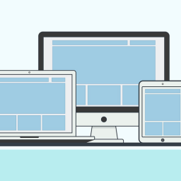
How to use smartphone functionality in RWD to improve user experience
With Responsive Web Design still in its infancy, its possibilities have yet to be fully explored and realised. Nevertheless, this hasn’t in any way deterred savvy organisations, eager to implement a one-site-fits-all strategy, from the take up of RWD, encouraged, perhaps, by an endorsement from search behemoth, Google.
Unfortunately, while the RWD philosophy promises a website accessible to almost all in a multiplatform world, there has been an eagerness to simply resize and reorder the desktop website to fit the smartphone, without exploring how the mobile user experience can be improved.
This might be down to a number of factors, including budgetary constraints, poor communication, lack of originality, and sheer laziness on the part of the design agency.
The problem with RWD as relates to user experience
Every man and his dog has a website, designed for the PC screen, and offering features that are tailored to the PC experience. This is where the problem arises, as the easiest and cheapest road for the design agency to take, is to ensure RWD renders the website on the smartphone screen, then leave it at that. With this approach comes the bloat of all those bandwidth-stripping HTTP requests, and unnecessary code and data, intended for desktop devices. So CSS is used to remove these elements, resulting in a rather vanilla website that does nothing to capture the functionality of the platform upon which it’s being served.
One solution comes with the ‘mobile first’ philosophy, in that you build the website for the smartphone, and scale up from there. Of course, this assumes that you have a budget set aside to start again from scratch.
If, like most, you haven’t, then the extra cost might well consume the benefits of going Responsive in the first place. It’s the age old dilemma of whether the advantages outweigh the costs. The all important ROI.
However, all is not lost, and, as you might already know, we at Usability247 are big fans of Responsive Web Design. As stated at the beginning of this article, it’s a philosophy still in its infancy, but, to our mind, the best method of delivering a consistent multiplatform product.
The solution for RWD
The key is in providing value, and enhancing the smartphone user’s experience. We recommend setting 10% of the RWD development budget aside, and directing it towards creating something that moves the mobile user away from just a desktop-lite experience, and offers a higher engagement factor. After all, the mobile user has different motivation, and expects a different experience to the PC user.
So maybe something that incorporates geo-location, one of the best supported features across mobile browsers, which both personalises, and localises the experience for the user, could make the difference between engagement, and indifference.
How you choose to leverage smartphone functionality (original ways of interacting with the touchscreen or scanner, for instance) is up to you, but doing it right can mean turning a flat, vanilla user experience, into something more immersive.
Increase customer engagement, and improve user experience. To find out how, contact UX24/7 today!


[…] are just a few of the options available for improving the usability of radio buttons in responsive web design. If you have any suggestions of your own, why not let us know in the comments […]