O2 refreshes store mega menu using generative taxonomy research
O2 is a telecommunications service provider in the UK, owned by the Spanish multinational Telefonica. O2 is the second-largest mobile network operator in the UK with 25 million subscribers.
As well as the UK, O2 also operate in Europe and North, Central and South America. The company has around 6700 employees, over 450 retail stores and sponsors England Rugby, The O2 arena and 19 O2 Academy music venues across the UK.
The navigation for the O2 website had, like so many websites, grown organically over time. The O2 team felt it had become too business centric and analytics suggested visitors were not finding their way to key content. Crucially they felt the navigation was having a negative impact on conversion through the shop.
Taxonomy redesign involves card sorting methodologies to deliver a customer centric navigation. Card sorts require users to group content items together as they see fit and to name that group. Alternatively they can sort content items under an already named group.
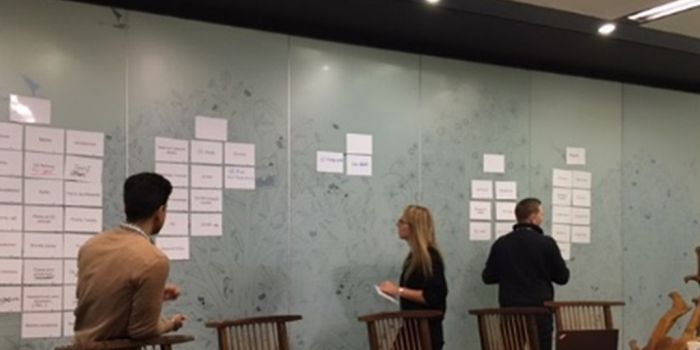
It is important to include stakeholders when redesigning taxonomy and navigation containers. When they have grown organically over time there will be business reasons behind the structure and these need to be ‘unpicked’ and placed into context. The context is provided by the customer view which means the project consists of the following elements:
- Customer quantitative card sort: a large sample of users using online software to group and name content items.
- Stakeholder workshops: One-to-one and group sessions to identify the business-centric taxonomy and political context.
- Tree test of the proposed IA’s: Tree testing is a methodology that evaluates whether a proposed Information Architecture works as expected.
For the O2 requirement we ran an online card sort with 500 users split between non and existing O2 customers. They were asked to sport 50 navigation items into groups that made sense to them.
QUICK FACTS
- Generative design research to refresh shop mega menu
- Interviews involving key internal stakeholders
- Qual & Quant card sort to inform developing taxonomy
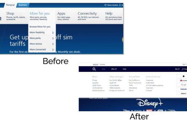
- Refreshed menu structure and navigation container
The resulting taxonomy was implemented on the O2 website and delivered the targeted improvement. The research showed that:
- The website was struggling to contain the increased range of services on offer
- Vague, inconsistent or poorly understood content labelling was a growing problem
- Simplification of the navigation was well received by stakeholders and customers
- Graphics in the mega-menu often caused confusion, particularly when technology related.
“UX24/7 are great. Their ability to work alongside us, often at short notice, and deliver such high-quality user insight has been a breath of fresh air. Paul and his team of senior experts strike a lovely balance between integrity, professionalism and fun!”
Stewart Griffiths
Head of User Experience, Design & Copy, Telefonica UK


