
You might already be using responsive design – or you might never have heard of it. If the latter is the case it could just be worth your while to learn a little about the concept and how it might apply to your multi-platform e-commerce strategy.
Multi-platform e-commerce is the only way
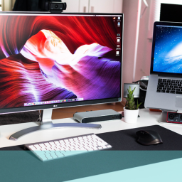
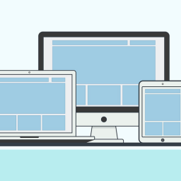
All businesses these days need to be aware of the multi-platform aspect of web design; how users interact with different media and what their expectations of different platforms are. This means your design needs to adapt to these requirements and reflect the opportunities (and limitations) of the media accessing the site. This need has the potential to completely overwhelm your e-commerce efforts. Reconfiguring your website for all the possible platforms – smartphones, tablets, netbooks, kindle and now t-commerce (your website appearing on TV screens) – is a formidable challenge and can be time-consuming and expensive. This is where responsive web design comes in.
Responsive design gives you ease and control
The concept is based on the principle that web designs should respond and be adaptive to users, environment and their behaviour within that environment. The variables will be screen size and orientation, platform type, device usability and so on. Responsive design technology provides a variety of flexible grids and layouts, resizable images and intelligent media querying enabling the software to interrogate its environment and reconfigure to accommodate new parameters.
This means you only require one code for the layout and content management of all your multi-platform offerings and anything you change or add on one platform will automatically be adapted and displayed optimally on the others. In practical terms, the responsive design adapts to the appropriate style sheet when it recognises the medium it is working with.
The future is multi-platform plus – so you need to be ready
As more and more devices come onto the market offering more flexibility in many of the features the permutation of adaptation can become almost infinite. And many smartphones and tablets enable the user to change both orientation and size at will introducing another variable into the mix. It is not practical or economically feasible to continually produce new designs to meet these needs so responsive design is really the only option for the future.
Smart TV goes beyond your usual multi-platform strategy
The issue for smart TV though perhaps demands a little more consideration and planning. TV is a very different medium to any of the other platforms currently being served. People interact with it in a specific way and the user experience will probably need to be much simpler and more obvious than the usual multiplatform solutions. TV viewers also expect to be entertained and for websites to be stimulating and engaging so smart TV apps will have to work harder and be produced to a different standard.
If you would like to hear more about responsive design or smart TV apps why not drop us an email hello@ux247.com.


