How simple is too simple? The UI and the UX
“Complex things will require complexity. It is the job of the designer to manage that complexity with skill and grace.” – Don Norman, co founder Neilsen Norman Group
Simplicity is a good thing. Simplicity limits bad choices. Simplicity reduces the likelihood of confusion, and allows you to achieve a goal with the minimum of effort.
With the modern emphasis on ‘everything NOW!’, and consumers demanding the quickest route to satisfaction, simplicity has to be the only way forwards so far as user experience is concerned. Or does it?
Sometimes over-simplification can cause more problems than it resolves.
The bare bones of user experience
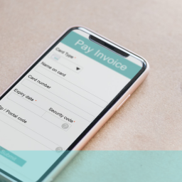
The temptation for some user experience designers, when it comes to building a user interface, is to strip everything to the bare bones, hiding as much detail as they think they can get away with. This creates a clutter-free environment, which supposedly directs the user, with the minimum of fuss, to where they want to go.
Two concepts have been identified, pertaining to simplistic UI design, and the presentation of information:
- Adjacent in space – Where the elements appear together on the same screen
- Stacked in time – Separating a website’s functionality (such as navigation) into a series of screens
The former places everything at the user’s fingertips, giving them full control of their experience. This reduces the number of operations required to carry out a specific operation, but, dependent upon how it’s presented, could make the UI more confusing.
The latter presents a clean, simplistic UI, but adds extra operations to the user’s journey, and in some instances might lead to them getting lost in the site’s architecture – an example of over-simplification becoming more confusing.
Engagement is key to providing a great user experience. If simplifying a home page to the extent that it now fails the user’s expectations, sends them on a wild goose chase, or simply lacks the level of interaction required to draw them in, then it’s a bad thing.
Finding the right mix for your users has to be achieved through solid testing, and following up on the results. That way a happy medium can be found that neither alienates, nor complicates.
Don’t let simplicity confuse your customers. Ensure the happy medium with usability testing. Contact UX24/7 today!