Tablet and Smartphone User Experience
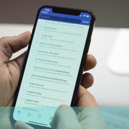
The rise in the use of smartphones in recent years has been meteoric and the impact significant and lasting. There are now almost 1bn smartphones in Asia alone, a staggering figure when you consider that in 2009, there were less than 90 million in the region . Tablet usage is now also growing at a phenomenal rate with a recent study suggested that 90 million Americans will use a tablet in 2014.
Different User Experiences
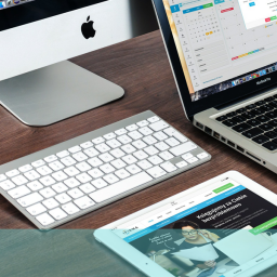
Smartphones and tablets provide a completely different user experience with location and the nature of the interaction often dictating what users want. Designing website interfaces for these devices consequently requires a good deal more thought and creativity than for laptops.
One aspect of tablet v laptop use that demonstrates this point both effectively and vividly, is the tendency for users to want to scroll vertically on laptops but horizontally on tablets and smartphones. This is an interesting and quite fundamental feature of the smartphone user experience. Part of the reason for this dichotomy might be that we’ve grown up with computers, and more recently laptops, where the interaction is produced by keystrokes or mouse use. Page design was naturally bounded by the edges of the screen and the instinctive movement was downwards. When touch screens came in, the natural movement seemed to be to swipe horizontally and to reach out beyond the edges of the page for additional information.
Image Conscious
Tablet and smartphone design is also more likely to incorporate a high proportion of images with icon and picture galleries often providing navigation vehicles for sites. Research has shown that this creates an almost overwhelming instinct to move laterally through the information, regardless of whether it is presented in a landscape or portrait orientation. Research has also indicated that users prefer a carousel type display for smartphones and tablets. In this configuration, rows of images are used with simple captions to indicate topics or stories. This both facilitates and encourages horizontal swiping and tests suggested that the smartphone user experience was simplified and enhanced by this mechanism.
Different approaches for different platforms
This relatively simple yet basic divergence between the types of device is emblematic of the different mindsets required when conceiving and designing interfaces. Displays for smartphones and tablets are, of necessity, going to be more image-laden and therefore lend themselves to a different type of interaction. A straightforward and fairly one-dimensional piece of research was able to throw up this piece of information and also suggest ways in which it might be used and exploited by the creative website developer.
Sometimes one single, simple insight like this could make a huge difference to the impact your website has on the smartphone user experience, and increase the engagement and effectiveness of your site considerably. These research findings were relevant to smartphone user experience generically but it is possible to discover site specific issues that could improve the way your site works on particular platforms such as tablets and smartphones.
If you believe your website performance could be improved on mobile platforms, why not consider user testing your current offering. For further information on how to go about this, give us a call free on 0800 0246 247 or drop us an email at hello@ux247.com.


[…] Yes, Google Search is accessible on mobile devices through web browsers and the Google Search app, providing a seamless search experience on smartphones and tablets. […]