
A look back at User Experience in 2014
As 2014 comes to an end it might be useful to look at some of the trends that have emerged throughout the year and try to interpret the pointers as to where the market might be heading in 2015.
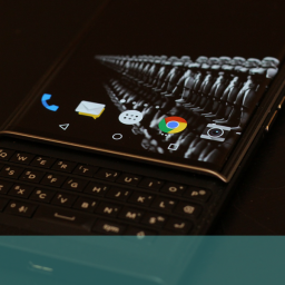
Globalisation and multi-platform/multi-channel usage continue to thrive and predominate. If you need any evidence of this just witness the scenes on Black Friday in the UK this year. This essentially American and previously internet based phenomenon (at least in Britain) transferred itself to the UK high street in a spectacular (and some might say worrying) fashion. Another major media event that gave clear direction to the multi-channel trend was the launch of the Apple iPhone 6 and 6 plus heralding the computer/telecoms giant final acceptance of the large-screen option with the two new products weighing in with 4.7” and a massive 6” screen for the 6 plus.
Not all news and developments were quite as high-profile as these but there has been a definite, noticeable and gradual movement which has implications for the future of anyone in the online, telecoms or ecommerce market (which really should be everyone by now).
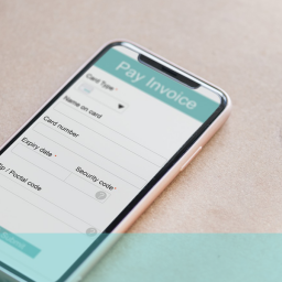
It will come as no surprise to anyone who reads this blog that the rise of mobiles and tablets in ecommerce continues to grow significantly and, for the first time this year, combined sales through these devices is set to outstrip PC throughput. It seems that the vast majority of retailers, even the most traditional businesses and the sluggish, massive conventional retailers have started to fully appreciate the potential and the largest of these (such as WalMart and GAP in the US) are now posting the biggest ecommerce gains. All of the growth in retail is now online with conventional outlets experiencing zero increase on previous years.
The role of smartphones and tablets is also beginning to take on specific definition and, although more people use smartphones for research and sourcing products more sales actually occur on tablets. This is probably due to the larger screen size and ease of navigation and checkout. Indeed, many retailers seem to be concentrating their design efforts on tablet checkouts with many smartphone applications still less than helpful in this area. Perhaps as the large screen smartphone begins to wield more influence, this trend will change.
With the prevalence of multi-platform retailing, responsive design remains a vital element in delivering improved user experience and this trend is likely to continue and grow in importance as online retailing becomes more and more varied and sophisticated. In terms of the physical design, minimalism seems to be the current watchword. The clarity and cleanness of a flat design has been embraced and encouraged by many developers. Basically, this means the elimination of graduated tones and textures, restriction of colour usage, larger fonts, less text and more space.
Techniques such as parallax scrolling are also helping in this respect, using technology to save the viewer physically scrolling through a seemingly endless page of content on a smaller screen. There has also been a drive towards single page, big impact websites among the leaders and innovators using striking pics which the latest technologies are endowing with more crispness and edge and going for simple and immediate grab. Condensed and simplified navigation menus help in achieving this more unified vision and declutter and facilitate both the look and functionality. Devices such as the Google Now cards concept also promise to be useful in providing clear, impactive and helpful information and pointers to users, a feature which the short attention spans and need for instant responses and actions, especially with smartphone users, seems to dictate.
Continuous connectivity is becoming increasingly important in a significant portion of the population’s lives and innovations that provide access to this are likely to find a good reception. The way the various components link and interact will also be a critical factor in success for hardware and software developers and the businesses that use the technology for selling. We can expect to see growth in devices like smartwatches and personal health monitors in 2015 – even smart homes and smart cars are likely to begin to emerge as part of the online envelope.
The future really is here and now – and demand for immediate, effective and easy-to-use access to all sorts of online applications, information and services is likely to accelerate as the technology drives the practical functions and services ever forward.
If you want to stay up-to-date with what is going on both technologically and market-wise and ensure that your ecommerce site keeps competitive, why not call us free on 0800 0246 247 or drop us an email at hello@ux247.com.
And keep tuning in to this blog in 2015.
Have a happy and successful New Year.


