

Despite our love for Responsive Web Design at UX24/7, and the handy solution it offers for websites in a world of multiple screen sizes, we are not so blind as to think RWD a user experience ‘magic bullet’, free of its own drawbacks.
Here are 5 RWD limitations, which can impact upon user experience:
1. Mobile is not desktop
The mobile user experience is not the same as the desktop experience. Users expect different things, engage in different ways, and approach with different intent. RWD has to tone down, or lose certain aspects geared towards improving the mobile user experience, such as catering specifically to mobile’s on-the-go nature, in order to provide an across-the-board compromise.
2. Functionality and features
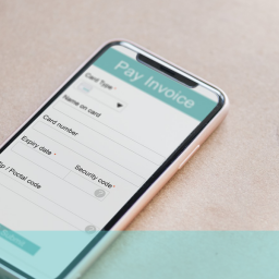
A responsive site is web-based, and therefore, unlike an integrated native app, unable to take advantage of a smartphone’s functionality. A richer mobile user experience can often be attained from harnessing smartphone features such as geolocation, gesture recognition, email, and camera.
3. CSS media queries
Responsive Web Design requires the implementation of CSS3 media queries to allow the resizing and rearrangement of web pages to suit the device upon which they’re served. As media queries only became a W3C recommended standard in 2012, some older mobile browsers may lack compatibility.
4. Load time
As a responsive site is a single site that adapts itself on the fly to the screen capabilities of a particular device, the user is downloading the same code to a mobile, as they would to a desktop. With mobile internet speeds already lacking the pace of high-speed broadband connections, the bloat of unnecessary Javascript, HTML etc that RWD might bring, can hinder the user experience by prolonging load time.
5. Complete optimisation
Despite the obvious benefits of responsive design, in bringing a usable version of your website to the widest audience possible, as RWD stands at present, it won’t provide as optimised an experience as a dedicated mobile site.
To ensure you offer your customers the best mobile user experience, across all platforms, contact us today!