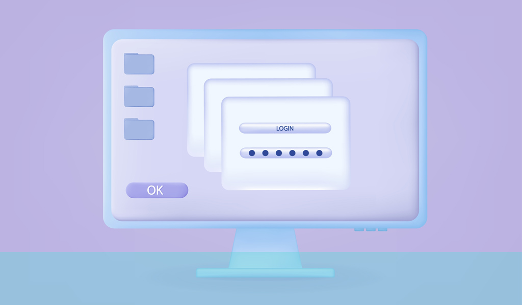
Modal windows were initially created as alerts to important or essential events displayed within user interfaces. As the design world advanced ever forward, businesses explored the many ways they might gather the data they needed to expand their audiences. One such practice included these handy pop-up boxes (many of which completely block the content on the parent page), which have subsequently become abused and misused, bent to the desires of designers, stakeholders, and marketers, and sadly, at the cost of good UX.
Here’s how.
Nobody likes being interrupted, but sometimes that interruption merits the inconvenience.
Are your modal screens necessary or gratuitous interruptions?
For example, if you’re holding an important conversation and someone interrupts you to tell you someone’s breaking into your car or your house is on fire, you’d thank them profusely and jump into action to resolve the emergency.
However, if someone interrupted that same important conversation to ask you about the weather or your favourite colour, you’d probably get rather annoyed at such an unnecessary intrusion.
The same goes for modal dialogs (or dialogues). When used correctly, they’re life savers (well, beneficial to the user, at least); when abused, they’re annoying, inhibit workflow, and damage user experience.
In today’s article, we’ll explain what a modal window is and why it’s important that their use shows respect to your users and visitors to maintain ideal UX best practices.
Modality and UX
When it comes to modality, UX designers should always show special respect to the user’s workflow and only interrupt it with essential information.
As the Nielsen Norman Group states:
Modal dialogs interrupt users and demand an action. They are appropriate when user’s attention needs to be directed toward important information.
What determines ‘important information’ can be contentious at best. Surely, for the best user experience, that decision should be in the user’s hands. If you can’t respect the basic concept or are unsure what essential means to your users, simple testing can deliver the data necessary to drive appropriate modal window use.
What is Modality?
A modal window appears within or on top of the parent screen, rendering all of the page’s functional elements inactive. The modal dialog is designed to alert users to a specific event, requiring user interaction to close the window before they can continue interacting with the content or software as before.
Modality in Action
It’s fairly straightforward to see how important a save dialog modal window is. When this modal dialog appears, it asks if you want to save changes made to a document before closing. We’ve all been victims of lost work due to failing to save documents, so this option becomes a welcome helping hand for anyone creating important documents. With options to save, cancel, or not save before you can continue, the decision may halt operations, but it’s worth it. For anyone who’s experienced the frustration of lost work, they’ll be quite happy to have their work safeguarded by this system-initiated modal window.
At the other end of the scale, a pop-up that appears a few seconds into visiting a new web page requesting you join their mailing list or allow them to badger you with notifications before you can get to the content you want to read isn’t quite as essential or important to the user. It’s a mild inconvenience, but nonetheless, an inconvenience which, in UX design, doesn’t merit interrupting the user’s workflow.
As an additional option to gather new contacts, you can see why marketers love this action, but as far as UX goes, there are strong arguments about the correct use of such a component and debate surrounding how the feature is abused.
Types of Modalities
Modal Dialogues
The following examples show how modal windows are used in today’s digital environments:
- Pop-ups and lightboxes that fill the entire screen
- Alerts and notifications (including the lifesaving save dialog box and other modal screens that prevent user error)
- In-software and in-browser warnings and instructions
- Complex action options and workflows
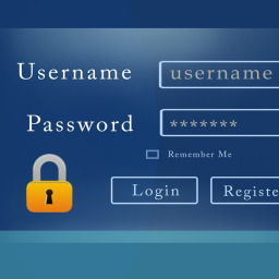
- Collecting necessary input details, such as account logins and payment methods, or granting access to mobile phone cameras, photo albums, etc.
- Some tooltips
- Confirmation of an action, such as when a form is successfully sent
- Onboarding wizards or new feature alerts when opening an app or website
- Marketing requests, such as newsletter, account, and discount/offer signups
Modeless Dialogues
As UX researchers, we want to encourage user participation but without affecting the flow or users’ enjoyment of our products.
The alternatives to modal windows are options that can do the same job without being so intrusive and blocking content on the parent page. Known as modeless dialog windows or nonmodal windows, these options don’t take over the entire screen and user interface and generally appear on the same page. They leave the user free to continue with what they’re doing while ignoring any additional requests or leaving them until later.
On mobile devices, where space is limited, a modal screen and nonmodal windows can look very similar, as both will likely take over the screen to display their message. However, the main difference lies with the navigation bar and header, which remain visible on nonmodal windows. Within modal screens, they have their own header or footer with options to cancel or progress by providing the requested or required input; on nonmodal window alternatives, the navigation bar remains intact, allowing many of the same options as before.
How does a nonmodal window appear compared to a modal screen? Here are a few examples of those you likely see and use on a daily basis:
- In-page dialog boxes, such as chat boxes and search functions
- Inline warnings, such as incorrect form field inputs
- Placing information on a separate page using the external link button
- Inline inputs, surveys, and comment boxes
- Inline slideshows and video players
- Cookies notifications in a pop-up bar at the top or bottom of the page
- Providing visible on-page content
- Tab menus
- Accordions
- Create email message pop-out
- Search boxes
- Pop-out sidebar dialogues
Benefits of Using Modal Windows
- User focus – Modal windows keep the user focused on what the page designer believes is most important, alerting them to critical events relating to the content or operation.
- Task completion – The designer includes a modal window that requests information to complete a process, such as an account login, without which the workflow or digital journey can’t continue.
- Error prevention – Again, an important modal screen that prevents critical errors by demanding the user’s attention to make an essential decision.
- Modal scenes that break complex workflows into manageable steps – For example, in desktop publishing, modal windows present the user with a contained set of options to apply formatting, filters, or other settings.
Challenges and Drawbacks
- User frustration – Unnecessary pop-ups interrupt the user’s flow, often causing them to lose concentration or their place in a document or distract them entirely from what they were doing.
- Unnecessary interruptions – Adding an irrelevant task to the user’s current operation is offputting and distracting.
- They block access to content – Disabling the parent page could prevent the user from accessing the necessary information required to complete the request set in the modal window.
- Accessibility concerns – Accessibility is a key area of concern in modal windows. Can everyone navigate the interruption, engage with or dismiss it, whatever their personal situation?
Best Practices for Implementing Modalities
We’d like to suggest that the best practices should be common sense; however, we appreciate how much stakeholders and target-hungry marketers love to grab users’ attention with their latest promotion or data-gathering exercises.
To ensure modal screens operate with healthy UX values:
- Have a clear and crucial purpose – Given the distraction fullscreen modal views create, ensure that you’re not breaking your users’ concentration or contact with the main screen unnecessarily.
- User control – If you must use a modal view, ensure users can dismiss it easily. Giving users control over how they consume content and provide information should be a high priority within your UX design.
- Accessibility features – Ensure each modal task provides necessary labelling, access, and operation for keyboard users and screen readers. It’s also crucial to save the user’s last active state so they can pick up where they left off, once such modals are dealt with.
- Testing and feedback – Given the importance of iteration in user testing and gathering feedback through regular UX research, we shouldn’t have to tell you how important this is. Our users should be at the heart of all user journeys.
Conclusion
When used correctly, modal windows can be incredibly positive and effective. They play a vital role in software packages, SaaS, websites, and apps. However, as we’ve discussed, overusing modals can have serious user experience drawbacks when used without respect for our users and website visitors.
To ensure a positive UI design experience, we need to understand what is important enough to limit content access until the user explicitly interacts with the modal dialog. While we can consult several decision frameworks to consider whether a modal window is truly necessary, perhaps the best way to deliver what the user wants, as with all good UX research, is to ask them.
Our user research experts are available to help you get closer to your customers. If you would like to arrange a no obligation call, get in touch by emailing us at hello@ux247.com or share your requirement using the form below.


