

Smartphone and Tablet User Experience – What is the difference?
Once upon a time there was the mobile phone. One day, it got ideas above its station and became the smartphone. Meanwhile, not wishing to feel left out, the humble PC was undergoing an evolution too, and the super-light, super-portable tablet was born.
Smartphone. Tablet. Tablet. Smartphone. And never the twain shall meet. Except they did … .
With the rise of Phablets, and the blurring of lines, how do you differentiate between the two, and what does it mean for the smartphone and tablet user experience?
Conversion Rates
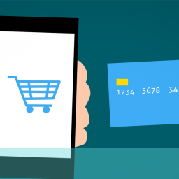
First off, conversion rates. Evidence suggests there’s a 1.4% increase in conversion rates on a tablet, compared to the smartphone. This not only underscores the necessity to optimise the user experience for both, but also suggests that tablets are seen as easier to use during checkout.
Content
The type of content consumed differs dependent upon device. Smartphones tend primarily to be used for communication, reading short bursts of content, and engaging with mobile apps. Whereas tablets offer a more immersive experience, providing a comfortable fit for viewing media (TV, films etc), in-depth reading, and browsing.
Location
Another differentiating factor between the smartphone and tablet is where it is used. Forrester Research’s Thomas Husson said, “Tablets are portable, while smartphones are pocketable.” This distinction is mirrored in the way that consumers interact with their devices, with smartphones being used much more on the go than the tablet, which is predominately limited to home use. There is also the factor of the smartphone user experience being a wholly personal one, whereas the tablet lends itself to shared usage.
So despite the merging of the two forms with devices such as the Galaxy Note, and other Phablets, there still remains a dividing line that needs consideration when creating smartphone and tablet user experiences for your customers.
You should be tailoring their experiences with device-specific content that reflects these differences and increases the desire to make a purchase.
To give your customers better smartphone and tablet user experiences, so that you can increase revenue and expand your business, give us a call free on 08000 246 247 or drop us an email at hello@ux247.com.