

Responsive Web Design
Obviously, your homepage is one of the most important pages on your site. It is often the first page many users see and frequently the place from which they navigate. The page gives users a first impression and an indicator of the nature and quality of your site, therefore, its significance cannot be underestimated.
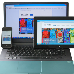
While you will find a lot of guidance on creating and usability testing homepages, not a lot of it deals with it in the context of responsive web design (RWD). RWD is a technical design process that allows easy configuration of your page layouts across a variety of platforms; so what you produce for desktop doesn’t just get squeezed into the limited space of a smartphone screen but is adapted and modified so it still works in the more restricted medium.
Homepage Design
While your homepage layout and elements are modified for smaller formats, the same principles for laptop presentation need to apply to achieve close to optimum performance. So your RWD version still has to incorporate the essential identifiers and enablers of your full-size homepage and your usability testing of your homepage needs to reflect its performance across a range of platforms.
This will include considering elements such as:
- Visual Identity – Your logo and any other strong visual identity components that you use throughout your business (whether online or offline). This associates the sites with the recognisable features of your company and reinforces and communicates your products, values, ethos to those who are already aware of them;
- Values – Statements about who you are, what you do, what you sell and what values you espouse as an organisation. Users need to know they have landed in the right place and that you produce what they are looking for and stand for the same kinds of things that they do;
- Navigation Aids – You need to help the user find what they want and move around your site as easily as possible. The homepage will often be the starting point so you have to use the space and devices as smartly as possible to aid this process. This could mean using colour, boxes and a search facility to highlight important areas and to give the user capacity to specify what they personally are looking for on the site
Homepage Usability Testing
Homepage usability testing needs to focus on how these requirements are met by your design and layout and where and how it can be improved. Usability testing responsive web design versions introduces other elements which will also need to be considered such as;
- Screen and font sizes – large sections of copy might become illegible in smaller formats
- Vital elements vs desirable elements – you might not be able to fit all the laptop elements into the visible section of a smaller format screen so you will need to decide which are critical
- Navigation – you need to make sure that the important navigation devices are clearly identified and usable in smaller formats.
With the huge number of device formats and sizes an unknown future potential, responsive design is essential to maintain your site’s impact and usability.
If you are unsure whether your site is optimised in this respect why not ring us on +44(0)800 0246 24, or email hello@ux247.com or contact us to discuss your possible requirements. We would be happy to talk to you about future development and improvement.