Usability Testing on Multiple Platforms
Usability testing responsive web design (RWD) means testing across multiple platforms, often simultaneously or in tandem. This is not always easy or affordable so you might have to make some tough decisions right at the outset of the project .
For example if your budget doesn’t stretch to testing on all platforms, which should you exclude? This is a relatively simple one to answer; the tablet format is pretty much a shrunken version of desktop in most cases but the limited real estate of the smartphone screen is a much more difficult challenge. So, if you are going to drop one medium it should, most likely, be the tablet. Desktop and smartphones still account for over 80% of internet access (though tablet use is on the rise) and a lot of the findings from both other platforms are likely to have some read-across to tablet anyway.
When doing the practical usability tests on your design, you need to provide your testers with the ability to transfer between the various formats and even use them in conjunction with one another. This provides more valuable information about how usability varies between the formats and what works in one and not in another. It also emulates real-world practice where users often transfer between media when accessing, navigating and using sites.
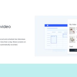
Observing how users interact with the various formats is probably best done by filming their interactions. There is software available that not only allows you to record but also to edit and comment online in real-time which provides a huge boost in terms of functionality, time and cost.
Particular features to look out for when usability testing RWD across platforms are:
- Font size and legibility – what works and is acceptable on desktop might well be too small or take up too much valuable space on smaller formats; so be concise, relevant and to the point;
- Use of design devices and functions – you will probably have to convey information and instructions in a more obvious way so consider the use of buttons, colour panels and boxes, hyperlinks etc to take users where they want to go or identify the status and type of information;
- Conveyance of vital corporate and product information – make sure your users understand where they are and what they are looking at instantly by the use of logo, livery colours, mission statements, marketing straplines and anything else which marks you out in your field of activity and expertise;
- Group important identifiers and information near the top of the page so it appears above the fold in smaller formats;
- Consider redefining tasks so they work more smoothly and fit more into the space and context of smaller screen areas – so think about achieving outcomes with different devices or functionality.
Responsive design is a massive benefit when designing across platforms but it does introduce its own set of problems. Don’t let this put you off as the advantages far outweigh the downside.
If you would like more information on RWD, how it works and how it could benefit your business, why not ring us on +44(0)800 0246 24, or email hello@ux247.com or contact us. We would be more than happy to discuss any aspects of your website requirements.


