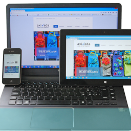
The modern consumer is accessing content via different platforms. Smartphones, tablets, PCs, and even TVs are now being used to browse and visit websites.
It is important that visitors to your website enjoy the same level of usability, regardless of the platform they view it on.
Continue reading for 5 Tips on improving your customers’ Multiplatform User Experience.
1. Design for change
Be mindful of the platform-dependent changes that will need addressing when designing your website. These will include modifications to the User Interface, as well as hardware and OS interfaces, to ensure a smoother experience for all your customers.
2. Respect the limitations of each platform
You can’t perform the same range of tasks on a mobile that you can on a PC. Likewise a tablet and TV – or any combination thereof. Each platform has its own strengths, own context of use, and own set of limitations.
Play to the strengths and the context, but don’t attempt to push beyond the limitations, as it will damage the multiplatform user experience.
3. Don’t make users scroll
What looks good on a PC screen may look plain awful on a smartphone or tablet. Cramming too much in on the mobile format will result in messy rendering, and inevitable scrolling. Horizontal scrolling being a particular turn off.
Use responsive, or adaptive designs that will resize or present an optimised page dependent upon device.
4. Provide functionality and features based on context
Context is what drives the consumer’s choice of device. The main uses for each are:
Smartphone
- On the go / at home
- Communicate and connect
- Short bursts
- Content snacking
Tablet
- At home
- Entertainment and browsing
- Relaxed
- No hurry
PC/Laptop
- Office or home
- Productivity, work-related
- The heavy lifting other devices can’t handle
- Focused, time-consuming, serious
- Research intensive
Offer device-specific features and website functionality that reflect these contexts, and enrich the multiplatform user experience.
5. Think about homepage content order for each platform
The homepages is the shop window onto your website. From it, the customer should be able to find what they want in as few clicks as possible. Different platforms present different screen sizes and methods of interaction by which the user can engage.
Tailor contextual content towards specific devices, and prioritise the order in which it appears on the screen, so that the important content (such as navigation, product search, special offers etc) is at the top, with secondary content linked further down.
Ensure your customers enjoy a seamless and consistent multiplatform user experience. To find out how, get in touch with UX24/7 today!


