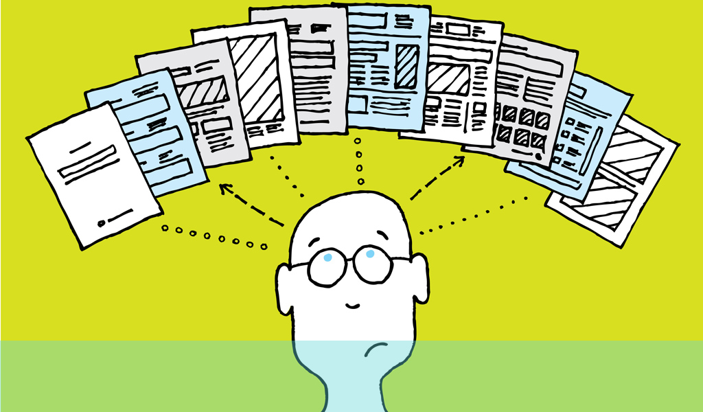
Put in its simplest terms, cognitive overload is providing people with too much information at one time. In the current communications age this pretty much inevitable as users are bombarded by media. But the internet suffers particularly from this problem and if you don’t employ usability testing you will almost certainly suffer.
There is just too much data out there and sites often load up users with surplus information as they go about tasks. If site owners make this too complex and onerous users are likely to give up. So it is in everyone’s interest to simplify procedures and processes.
The first and overarching principle you need to get into your head is keeping it simple. If users have to learn or memorise a series of actions to use your site – then you are in trouble. Similarly, if the processes are complex or long you are likely to lose them. However, there are a number of basic tenets you can use to ensure a degree of ease and regularise user behaviour;
- Use conventions and actions that are known and familiar. User behaviour can be driven by repetition and familiarity. The internet and digital devices and applications have been around for quite a while now. Conventions for positioning, icons, buttons, actions and other useful shorthands already exist. Use them as much as you can and your users will have an easier time.
- Have a look at the step processes and navigation required to move around or within elements and see if every step is necessary and contributes. If it doesn’t, eliminate it – or at least make it automatic or able to gather data or input from elsewhere to perform the necessary action. Anything that appears long and complex probably is. Analyse these processes and see if they can be shortened or simplified while getting mostly the same effect. If you reduce an action by say 25% and only lose 2% effectiveness that is probably a good trade-off.
- Find out what users value or use the most and make sure you keep these things as the main focus in your layout. Make important elements easy-to-find and keep to hand so that users can always locate and use them when they need to. In addition, you can help users understand exactly where they are and what they need to do next. This can save a lot of confusion and frustration.
- Make design logical and intuitive. This will help the user in both remembering and finding their way as intuitive prompts will be stored and recalled. If it looks like something should be found by moving to the right of the screen and it is, the user finds it easier and is rewarded for their intuition. User behaviour is driven by repetition and familiarity.
- People are inherently lazy so you need to make the process as effortless as possible. Try to imagine you are using the product and anticipate what would annoy, what you would like removed. Where can you insert helpful advice or indicators to make the progression transparent? How can you lessen the impact of something annoying that you have to include? How can you link and integrate steps or actions? All these can help in focusing on ease of use.
Cognitive overload is a very real problem in these days of mass media consumption. Make sure you do your bit to relieve it – and reap the benefits for your organisation.
If you would like to know more about how to reduce cognitive overload, please call us on +44(0)800 024624 or email us at hello@ux247.com.


