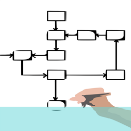
In its simplest, most straightforward, guise information architecture (IA) is the way your online information is structured on your website to make it easily accessible, navigable and comprehensible to the user. While this might sound and seem obvious in practice it can be a very complex and demanding process.
Putting the information together in a way that makes sense to all users’ needs is a difficult task. What you should be seeking to achieve is logic and transparency so that even information that is complex, or forms complicated, intricate links with other information, is presented in a clear manner with a rational structure and reasoning behind how it is arranged.
The importance of information architecture lies in its relationship with the user experience. The more intuitive and logical your structure is the easier it will be for people to locate, access and interact with your product.
There are a number of helpful principles and areas you can take account of in your process;
1. Categorisation – group similar items together in areas that will make sense to users, so they aren’t continually guessing where stuff might be.
2. Visual cues – human perception is very susceptible to visual cues, so help your users by employing visual devices such as boxes, shading, different typefaces, relevant images and icons, colours etc
3. Conventions – don’t underestimate the power of conventions. Although the web has been around for a relatively short span of history it has already developed powerful conventions – so use this to your advantage. Make sure elements appear where people would expect to find them. This makes it easier for your designers and your customers ultimately.
4. Use psychology and other proven methods, such as visual testing, to site particular elements correctly on the page. There are established principles for layout; don’t reinvent the wheel; use the research that is already out there.
5. Make sure the important guides to navigation and access are clear and stand out so the user doesn’t have to go looking for them. Provide a helpline, Q&A sections and other help to users which is well-flagged and easy to access and use.
6. Keep your content simple and focused initially so you don’t bog users down early with irrelevant or unnecessary content. They can burrow down into the more detailed, complex stuff later if that is what they are looking for. Keep the initial material on entry pages light and to the point.
Information architecture is important because it helps visitors to use and navigate your site quickly and efficiently. If the architecture is seriously faulty, users will get frustrated, possibly abandon their visit and might not return, potentially giving your site a bad review and poor reputation to other future users. Obviously, none of this is desirable; you want to make your users’ experience as smooth, enjoyable and positive as you can.
If you are interested in learning more about information architecture and how it can help improve your website, why not ring us on +44(0)800 024624 or email us at hello@ux247.com for an exploratory chat.