July 18, 2018

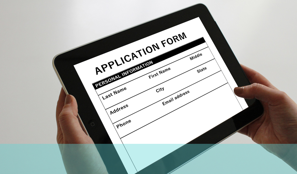
Online forms are often frustrating for online users, frequently being difficult to understand and complete and sometimes not even functioning in a manner which allows any sort of completion, let alone easy filling.
Forms are extremely important sources of data for your business. It is in your interest to make gathering this information as easy as possible – even more so if the form is a checkout or sales form. As ever, usability is the key to good practice here. So what are the basic tenets you should observe in form design?
- Keep the form as simple as possible consistent with gathering the data you need.
- Don’t ask for the same information over and over – use the info already gathered to populate other sections if necessary.
- Use understandable and common terminology so that people know what they are being asked to provide.
- Use pre-fill as much as possible and import data from customer records so the customer doesn’t have to remember and complete.
- Try andmake the sections and flow of the form logical so the context of the questions is obvious and makes it easier to understand what is needed.
- It might seem obvious but make sure the form works properly. I’ve lost count of the times I have tried to complete forms only to find I couldn’t click or type in the boxes. Make sure users can tab effectively and move between sections and boxes easily.
- With more complicated forms label the sections and input fields clearly so users know exactly what is expected of them in that area.
- Make the field sizes appropriate for the content likely to have to fit in them. This doesn’t mean make all the fields massive though. It can be annoying to have to follow the cursor through huge unpopulated fields to find out where you are at.
- Ensure that your error messages are clear and relevant e.g. if a field can only contain numbers indicate this. Problems often occur in this aspect is fields such as telephone numbers where brackets or hyphens are rejected. People often type phone numbers in this way so it might be worth accommodating them. It is best to attach the error message to the feel to which it related and flag it very clearly so the user can see precisely where the problem lies. Often it is a detection job to find out what is actually wrong with your input with some poorly constructed forms.
- Drop down menus can be useful but make sure they are obvious and comprehensive e.g. many do not have Dr as an option for title – there are lots of these around not just MDs so it could be worth including. Some people do actually get discouraged by not being to select their preferred title. The same applied to Mrs, Miss and Ms.
If you would like to learn more about the techniques of form design, why not ring us on +44(0)800 0246247 or email us at hello@ux247.com


[…] However, poorly designed forms can frustrate users and lead to abandoned transactions. At Web Design London, we specialize in creating user-friendly websites that convert. Improving website forms usability […]