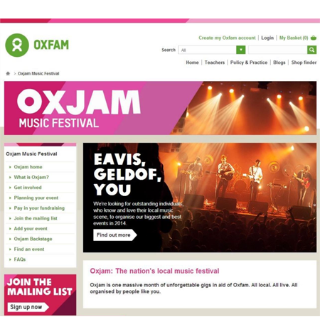
Expert Review of Fundraising Website
Oxfam puts the Community Fundraising Website through its paces

Oxfam is a charitable organisation founded more than 70 years ago during the Second World War. Established to assist with famine and poverty in Belgium and Greece as a result of the war, the organisation is now a global movement of people who share the belief that, in a world rich in resources, poverty isn’t inevitable. They believe it is an injustice
which can, and must be overcome.
They have used digital channels in various ways since becoming the first UK charity to have a bespoke online shop, and in 2013 they extended their digital strategy to encompass supporter engagement. Within this initiative the “Community Fundraising Website” project was launched.
A key reason for using digital channels to underpin supporter engagement was the need to excite, engage and enthuse supporters. The ultimate goal is to encourage supporters to sign up to organise and/or participate in fundraising events for Oxfam.
With limited funds and a strong desire to deliver an excellent user experience, Oxfam GB turned to UX24/7 to provide our expert review service of the community platform. Our review focussed on three, key user journeys: users looking for an Oxjam gig in their town; users wanting to create a gig for Oxfam; and a user needing peer to peer advice from the community.
Our usability evaluation was carried out in two days and a report with analysis, recommendations and charts was provided as the deliverable.
Our expert review service is guided by our unique methodology that evaluates your website, product or app against 48 attributes under five key groups: navigation; content; function; presentation and feedback. It will identify areas where usability could be improved together with recommendations for how to implement changes and also provides a UX Index score that can be used to compare your site, product or app over time and with competitors.
QUICK FACTS
- Oxfam Community Fundraising Website
- Expert review to evaluate each process against 48 criteria.
- Analysis plus UX index score
- Actionable recommendations and best practice examples
The usability evaluation revealed that there were a number of areas where the user experience could be enhanced. The three journeys reviewed performed well in the presentation and content categories and were excellent in criteria covered under ‘feedback’ with no usability issues revealed at all. However both the function and navigation criteria identified a number of areas for improvement.
One of these was in the Oxjam “create and event” form. The order of pages presented in the process, layout and instructions combined to create a confusing experience that failed to meet Oxfam’s identified business goals. The recommendation was provided together with best practice examples from Which and Next to illustrate alternative implementation options.
Catherine Baillie, Head of User Experience, Oxfam GB commented “the content of the report was very good. It was clear, well written and included actionable recommendations. It was really useful to have recommendations backed up with
examples of sites who’d designed friction free solutions to the same challenges”.
Oxfam is now working to implement the recommendations from the review so that the community fundraising website can achieve its goals and make it easy for supporters to sign up, run and participate in fundraising events via the website.
“It was really useful to have recommendations backed up with examples of [other] sites”
Catherine Baillie
Head of User Experience. Oxfam GB


