

Menus on mobile devices and usability
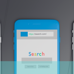
As the image that accompanies this blog post shows, websites that are not optimised for mobile present significant issues for usability and not least in the function of the navigation. The screen size looks tiny when a full sized website is presented on a smartphone and in many ways this illustrates the challenge for designers. Attempting to present on a smartphone all the choices available in the navigation on a full sized website even when using responsive web design can be a usability nightmare.
We have already looked at the issue of mega drop-down menus in a previous blog post so in this post I want to deal more with the challenge of rationalising menu items. For example, retailer H&M, group all the shopping categories that are displayed on the full sized website (ladies, men, kids, home and sale) into one category “Shop” on the tablet version of the website: tablet.hm.com. They then group all sub-categories of [say] ‘Men’ under a “View All” button that brings the full menu over the top of the product content. On the large site these categories are presented as a left hand navigation at every screen width.
M&S, in their very new website which is partially responsive, choose to use a Hamburger menu on the homepage which gives a cleaner look but I think limits the options available. When sub-categories are selected the left hand menu appears and disappears and the user needs to return to the main menu button each time they wish to navigate. It is still navigable by I would think the user is required to work a bit harder and that usability therefore suffers.
I think M&S have been brave to try a new method for mobile navigation and I think we will see a lot more experimentation in this area because there is no ‘perfect’ solution yet. User behaviour is changing as we observe when website usability testing and so keeping pace is going to be tough. The usability of mobile menus may well suffer in the next year or so, particularly if user experience design doesn’t change.
If you would like to learn more about how users navigate using mobile device menus please get in contact with us and we would be delighted to help. You can give us a call free on 0800 0246 247 or drop us an email at hello@ux247.com.