

It is a matter of simple practicalities that when websites and apps are reduced down to mobile screen size there are going to be issues of space, typeface, navigation and so on. It is just one of those inevitable facts of life. But that doesn’t mean there aren’t ways of making the user experience better – and, of course, lots of opportunities for making it worse!
Here we look at some of the most common errors that app and website designers make on mobile products and what you can do to avoid them and make your offering easy and pleasurable for the user.
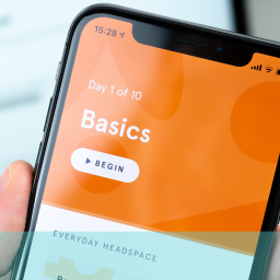
Menus
Menus have always been challenging to get right. Surprisingly, it is not just trying to cram too much in that is the only problem. Obviously because of the pressure on space you need to consider carefully what to put in your menus – and it can’t be everything you have on the desktop version.
A process of prioritisation needs to happen and this should focus on the situation the uses find themselves in – ie. using an app on a small screen trying to find their way to a particular function or product. Imagine yourself in their position – what would be the most useful options to help you navigate the app?
Try to anticipate their situation and needs and design accordingly. But don’t pare down too much as too few options or bare descriptors can be as bad as too much. If the user can’t work out where to go next or where your selections might take them they can become frustrated and disillusioned pretty quickly.
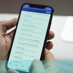
There is always the alternative to hide the menu using the so-called hamburger option where an icon in the corner of the screen indicates a hidden list but a further click is required to view. Opinions are very divided on this but it does introduce more actions and searching for the user which has its problems and frustrations.
Conventions
There can also be temptation to design your navigation specifically for mobiles to the extent where you dispose of some of the established norms and conventions applied to normal desktop searching. You might believe you are helping the user if you can shorten, condense, combine some actions on their behalf – and, if you come up with something genuinely creative and time-saving, you might achieve this is the long-run.
In the short-term, however, you could just be causing further confusion and frustration for users who don’t understand what it is you are offering them or trying to achieve. It might be best to leave innovation to another time or at least introduce it gradually and well contextualised so there is a better chance of users understanding.
Location
Users need to know where they are in an app and it is not always evident from the context. It is a good tip to help them identify their location by, for example, highlighting the icon of the option they are in on the menu or having very clear and obvious section titles or identifiers.
Physical limitations
Because of the screen size and the way people use their mobiles there are certain physical considerations that can come into play; for example, people tend to use their thumbs so it is a good idea to put main navigational devices at the bottom the screen and make them pretty big so they can be more easily hit without error. Devices such as swipeable cards and full-screen navigation can also make the user experience easier and more accessible by employing simpler and broader gestures.
If you are interested in finding out more about how to make your mobile apps more user friendly why not ring us on +44(0)800 0246247 or email us at hello@ux247.com.