Importance of accessibility
Accessibility is a critical aspect of UX design. I’m sure this is a principle we can all understand and agree on. Yet sites continue to be designed with major issues in this area. Accessibility should aim to make your content as easy as possible to get into, move around within and use. This should apply for users in all states of ability, impairment, temporary or permanent restriction. It should anticipate what a user might be doing, how they access content and what their state of enablement might be.
Often the fixes for accessibility are not that difficult or lengthy. Research has shown that accessible sites get more hits, less complaints – and fewer potential lawsuits! There are hundreds of millions of possible users in the world. Many of these have some form of disability or restriction whether it be visual, manual or mental. Denying them ease of access to content is both ethically and commercially undesirable.
Addressing main issues
Here are some of the main problems users might face and how you can allow for them in your UX design:
- Many people have difficulties with colour so don’t rely solely on colour to flag or differentiate content. Use other types of marker such as pattern or shape, so those with problems can make visual connections. In addition, make sure there is sufficient colour contrast where there is text as some users will find content on intrusively coloured backgrounds hard to read;
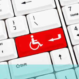
- Believe it or not, many people use a keyboard as their main instrument of navigation. Design your pages so they can be navigated in this way and are logical and predictable in how this works;
- Make sure that the enabled state of an element is clear so that users know what they can click on and produce an outcome. This can just mean putting a blue outline around active buttons;
- Consistency – maintain consistency of headings, hierarchy, components so that when users land on a page they recognise the layout and elements. Users should be able to respond to and follow these without guesswork or ambivalence in what they are doing;
- Meaningful links – make sure your links are meaningful and relevant and don’t use vague phrases or terminology such as More details, Click here or Further information. These don’t tell the users where they are going and what will be waiting for them at the end of the link. Be specific on where they are being taken and what information is featured there;
- Remember that not everyone who uses your site is completely able-bodied. Many users have manual restrictions or visual impairments so test your site against these possible restrictions. Think about having elements like good captions or descriptions of processes, images etc. Alternatives to manual operation like gestures or hover functions are also useful. Try to put yourself in the position of a user with an impairment and imagine how they would cope with your current website layout and functionality.
This is an important issue now especially as more and more people with some form of physical limitation are using the web and expecting sites to be accessible. It is also a legal (and ethical) issue so you are bound in many ways to consider it. If you would like more information on accessibility, ring us on +44(0)800 024624 or email us at hello@ux247.com.