
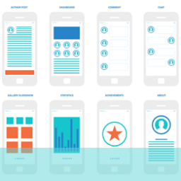
Icons can be very useful devices for quick identification of functions in UX design but you need to be careful about what you use and how you use them as they can quickly become confusing and even a deterrent to use if people cease to trust or understand them.
Icons can be classified in three categories;
- Universal, which as the name suggests are widely and readily recognisable and unambiguous; unfortunately there are very few of these (the home symbol and the magnifying glass for search being two clear examples).
- Unique where an icon has been developed for a particular use on a particular site. While not readily recognisable these do have the benefit that, if used extensively, visitors will quickly become familiar with the purpose and designation.
- Conflicting icons; this happens where the same icon is used for different things on different sites. Examples of this type might be the pen icon which could mean write to us, or fill in a form or box; a reversing arrow which might mean undo or go back.
Icons can be explained with the use of text labels describing what they do; while this, to some extent, defeats the purpose it can be helpful in establishing a relationship and association and, if used sufficiently, the icon might get some traction in users minds. If you are designing new icons for functions on your site it is extremely important that you keep in mind that there needs to be some correlation between the icon and function that people can link and remember; it is always useful to research icons for similar functions on other sites. If you can produce something that suggests the use and connects with other types that users have already seen used there is a greater chance of yours becoming embedded.
Other important features of icons to consider when incorporating them into your UX design are:
- Make sure the target area is big enough for people to hit; there is nothing more frustrating than having multiple stabs at a button and then eventually having to enlarge it anyway! Also leave sufficient space between icons so that users aren’t continually hitting the wrong one – another constant source of frustration.
- If you do use text labels make sure the icon is to the left of the text and close enough to be directly associated with it and not confusing as a potential alternative.
- Icons that work well are simple with no great detail or embellishment but a strong suggestion of the shape and nature of the representative object.
- It is always worthwhile testing your icons on people who haven’t previously been exposed to them. This can provide a lot of information about relatability, size, positioning, visibility and expectation and help you to develop icons that work on all levels.
Icons can be a great asset in your site’s UX design, especially if you are working with limited space such as with mobile apps. If you would like to learn more about their development and use, why not ring get in touch at hello@ux247.com.