UX tools to help you retain the attention of your audience
Ever since humans started producing printed communication there has been competition for people’s attention and the advent of electronic communication has increased this by a massive factor. Now that a significant amount of the whole sum of human knowledge is available at the touch of a key how we apportion our time and attention to the various elements that affect and interest us has become a major issue.
While this is not necessarily a zero sum calculation (people generally now probably spend less time doing other things like going to the pub or playing sports than they do online!) there is always going to be a finite limit to the amount of time and attention we can give to individual subjects. When the internet was a novelty user behaviour was more indiscriminate – as we were fascinated and intrigued by just what was available – and relatively unsophisticated in what was searched and viewed and how it was accessed.
Now there is so much available and so much competition that we have to be very careful and selective. While not everyone will set an exact time limit on the amount of time they are willing to spend looking for something online, they will certainly be looking for precise and relevant navigation to their destination and things that don’t appear helpful are likely to be ignored and discarded.
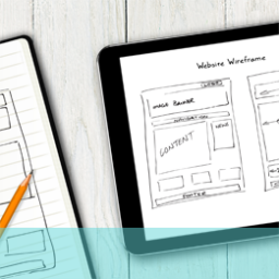
What UX tools can you use to retain attention?
The process of attracting and holding attention, particularly of online users, has been the subject of intensive research in recent decades to the extent that design has become as much a science as an art. There are some learnings about likely user behaviour that have emerged from this and these can be very useful in making basic decisions about layout and design; here are a few of them;
1. The human eye and brain tend to group items together that are in close proximity and view them as being relational. This is helpful when you are looking to indicate or prompt and action from a user; for example, if you wish the user to click through to more information or material make sure the navigation portal is close to the message that is likely to initiate the action; similarly, if you have a piece of text such as an error message or popup that relates to a particular action, put it close to the element it relates to. It is frustrating for users (plus they are quite likely to miss it) if these rules aren’t observed.
2. Don’t make processes complicated or lengthy as users are liable to forget what they are doing or get distracted or deflected into something else. If you have to include a sequence of steps in order to take a user somewhere try and keep it short and reinforce and refresh what they are doing so they stay engaged and focused.
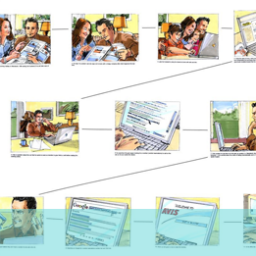
3. Constantly remind users where they are in the navigation, why and how they got there and where they are going. This can be done with tags which show where they currently are on the site and the last place visited or a hierarchy of heading subjects at the top of the screen. So if the user pauses or loses focus they can reorient themselves quickly.
4. Motion and contrast are also useful UX tools in the battle to attract and maintain attention; so if you have something important to convey or wish to move the user to the next level these devices can be employed to good effect.
5. Finally, two thoughts that might appear conflictual – but think about them anyway. Try to simplify and target the user journey as much as possible to their needs but spice it up along the way with visuals, different layouts and patterns to keep their interest and attention.
If you would like to know more about how to engage your audience, call us on +44(0)800 024624 or email us at hello@ux247.com.