Problems with financial sites
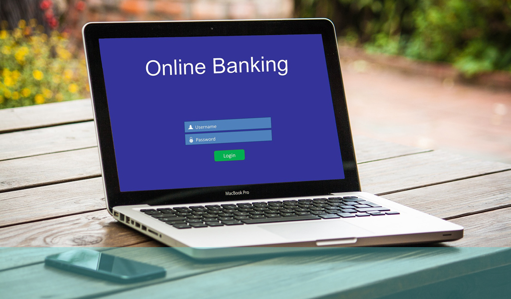
Financial services are probably one of the most complex areas for online user experience. They present particular challenges to designers in making often complex concepts transparent and engaging and retaining user attention and commitment. Unfortunately, the reality is that banking sites in particular are often unwieldy, not intuitive and not friendly in terms of user experience. Many are not easy to use and navigate, don’t give you what you expect or take a long route to getting there.
Security issues
To be fair, security considerations are part of the problem with some of the issues surrounding speed and usability. However, financial institutions (particularly banks) generally need to smarten up their acts. The onus is on them to provide sites that offer reliable security and safety combined with speed, accessibility and ease of use.
Design principles
Online business in financial marketplace therefore need to be aware of several principles when they design and construct their sites;
- People like predictability and don’t like change. Research what is already available and working in the market and copy the good elements and practices from those sites. Users will feel more comfortable if they recognise some of the cues and triggers to progress around the site to the services and facilities they are seeking;
- Make the elements that the majority of customers are accessing the most prominent and easy to access. For banks this will be account information, transactions, loans, credit cards etc;
- Users want easily understood terminology and clear and comprehensible layouts of information. Don’t use industry jargon and try to simplify presentation of information so it is apparent and understandable what is being talked about. What the terms, figures etc that are being used represent should also be clear so users are in no doubt what they are dealing with;
- Easily identifiable icons or images can help users navigate your site and clarify where they are and what they are seeing. Again, if there are existing conventions that already do this well, don’t reinvent the wheel – jump on the bandwagon!

Current aspects of sites
Most banking sites are extremely dry visually and feature lots of figures and text generally presented in an uninspiring and unengaging way. Banking apps have made some inroads into addressing this and presenting cleaner, simpler information in a more readily digestible format. Generally the criticism that the user experience is not a good one here is a valid one.
Because financial institutions were offering an essentially functional service to clients they probably did not see the need to make any emotional connection nor bring aesthetics into the equation. They might have even believed such concepts to be frivolous in the context of the services they provided. This is no longer the case though and user expectations are higher and more specific in terms of what they want and how they feel they should be treated.
This important topic has some interesting technical and functional aspects which we will consider in part 2.
If you would like to know more about designing for financial services online, ring us on +44(0)800 024624 or email us at hello@ux247.com.


[…] This is part 2 of a two-part series. If you missed part 1 you can read it here. […]