Usability of B2B back end interface
Global Agency selects UX24/7 for their Telco client’s usability project
Our client was a global creative agency working for a multinational telecommunications organisation to develop a business telecommunication app (on both Android and iOS platforms) and a business mobile feature management proposition on responsive web.
UX24/7 was commissioned by the client to facilitate a moderated usability evaluation of a test build of this app as well as review a web-based ‘browse and buy’ journey and ‘My Account’ management. The aim was to identify usability issues that negatively impact the usability and user experience of the product components. It was also to understand the customer’s perception of the proposition.
We created a research plan to describe the evaluation process and the tasks we would set the participants. The evaluation consisted of 10 one-to-one sessions with user’s representative of the telecommunication company’s target audience. This was small business owners and employees from companies with 1-10 employees who are likely to, or already have, purchased a business phone service.
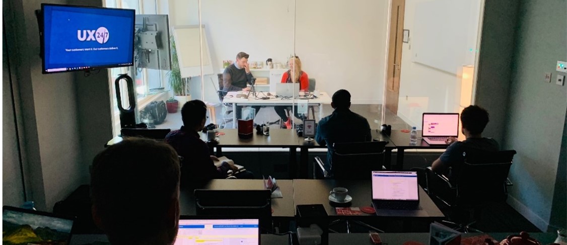
We ran 2 days of research with 5 sessions per day lasting around 60 minutes each. They were held in a market research facility in central London with viewing facilities, so the client was able to observe the research.
A test laptop was used with picture in picture software and a webcam to capture the participants head and shoulders. Both iOS and Android smartphones were provided and users were able to switch between phone and laptop during the session, using whichever was natural to them for the journey.
The key elements were:
- Tasks: There were 3 tasks they had to complete, 1 per stimulus.
- Platforms: The ‘browse and buy’ journey was completed on either desktop or mobile.
- Switching platforms: The new app evaluation was completed on mobile and ‘inviting a new user’ through ‘My Account’ was carried out on laptop.
QUICK FACTS
- Usability testing using real participants in a usability lab
- B2B audience with hard to reach participants
- Multiple proposition elements including app and responsive interface
- Working directly with our Client’s most important Telco client
Overall, users were happy with the ‘browse and buy’ journey, but some unfamiliar terminology caused confusion. The navigation was rarely interacted with as users preferred to opt for in page CTA’s. Filters and sort by options were well received but were not always visible.
The look and feel of the business app prototype resonated well with users because the experience was similar to that of apps like WhatsApp and Skype. Despite this, its purpose wasn’t always understood. The app was seen as a duplicate of features they already had on their handset.
The usability evaluation also reviewed the management of ‘My Account’. ‘Inviting a new user’ within this hub caused hesitation when it came to the invitation form. There was also some confusion due to ambiguous terminology which is common in user research of this type and with technical products.
These are some of the key areas of insight we uncovered:
- The business telecommunication app was well received and could be successful as a proposition once understood.
- The ‘browse and buy’ journey was sufficiently well represented on desktop and mobile but we recommended that the screen real estate could be better optimised. It was also highlighted that some desired features were missing, such as delivery and installation time from the point of ordering the product.
- Our insights highlighted the need for the design of ‘My Account’ to revisited to achieve a better understanding of the proposition and to make the labels and signposts more meaningful.
“I wouldn’t explore due to time constraints, I would look straight at the product”
Participant
As a next step, UX24/7 recommended further research into customer terminology and to revise the prototypes aligning them to customer expectations.


