

Taxonomy qual and quant research
UK omni-channel retailer uses taxonomy research to redesign mega menu

Our client is one of Europe’s leading specialist electrical and telecommunications retailer and services companies, employing over 40,000 people in eight countries across Europe.
In the United Kingdom, the organisation operates a range of household retail and online brands.
The clients main brand website is a key channel but its role had changed rapidly in the past few years. At the same time consumer behaviour has also changed and the online team wanted to ensure the eCommerce platform didn’t lag behind.
With increased focus on the online and challenging targets the commercial teams have focussed on online as a key channel – with more SKUs, extended range, categories, promotions etc. This change and focus have happened sporadically and with time pressures.
One of the key areas impacted is the mega menu, which has 1000s of products and has been regularly built up and added to, rather than optimised. This makes the navigation and online journey much cluttered and not easy for customers.
The primary objective from the brief was to optimise and reorganise the mega menu for currys.co.uk. The refreshed navigation should be customer centric, reflect new business requirements and enhance conversion.
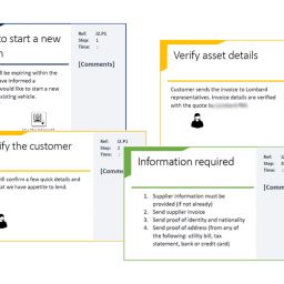
The taxonomy research needed to take into account the views of both customers and stakeholders. An approach was therefore developed that involved quantitative and qualitative card sort methodologies, together with a review of site analytics. Stakeholder interviews were also planned and to ensure their success the client engaged Board level sponsorship including a stakeholder wide kick off meeting.
As the mega menu contained hundreds of items the first task was to select the level 2 and 3 menu items that would be used in the card sort to define the level 1 categories.
The key workstreams were as follows:
- Project KO & Quick wins: review of site analytics and competitor navigation containers and taxonomy’s
- Customer centric taxonomy: There were two stages to the customer centric taxonomy workstream. The first was an online, quantitative card sort. This was followed by a qualitative card sort.
- Business centric taxonomy: The business centric research involved stakeholder interviews and an online card sort.
- Combined taxonomy: The combined taxonomy would be delivered as a result of the customer and business centric workstreams.
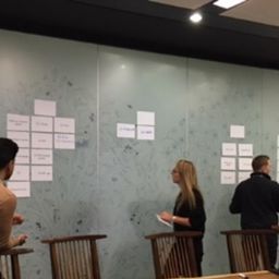
The customer centric quantitative card sort was carried out with 500 people recruited via an online panel provider. Software called optimal sort was used that enables users to drag and drop items to create groups and then to name those groups.
QUICK FACTS
- Stakeholders interviews from C-Suite to data analyst
- Quantitative card sort delivered online
- Qualitative card sort carried out in labs
- Actionable recommended taxonomy for A/B testing
The research found that the existing mega menu had suffered from unrestrained expansion together with internal organisation and nomenclature. It was also product-led which forced customers into siloed categories and segments. There was little opportunity to shop for an end-to-end multi-product and service purchase.
The good news was that the business stakeholders actually aligned with the consumer findings. Stakeholders wanted to improve customer journey integration and establish a more customer centric navigation. The sacred cows that had been expected, didn’t exist.
The outcomes:
The revised navigation was evaluated using reverse tree-testing to ensure it was effective. It performed well against the existing navigation and went live, initially using a/b testing.
The results were excellent. The new navigation container achieved the primary objectives of delivering a customer centric taxonomy that was also scalable for the future needs of the business.
The improved navigation also increased site conversion as customers find it easier to locate the products and services they are interested in. As a result, the new navigation container went live and further work has been carried out on the L2 and L3 levels to ensure a consistent approach and good governance.
“The mentality is not to remove, just to add, and add things to multiple menus”
Comment from Stakeholder


[…] they need and use it to achieve their goals (what they want from you or your website). Check out this case study to see IA in […]
[…] work, but to show you exactly how they impact the needs of our clients, we posted a case study, UK eCommerce retailer mega menu redesign, to show how much value this system delivered to one of Europe’s leading electrical […]