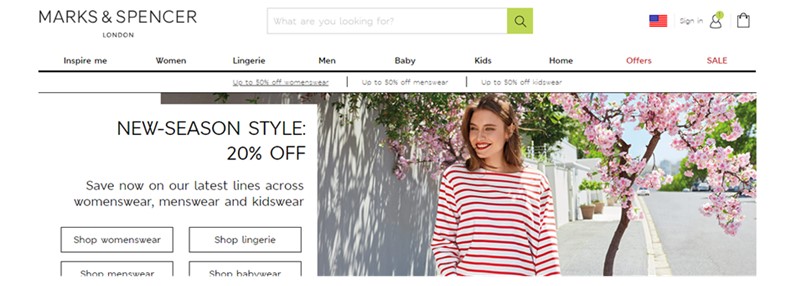
UX Research in USA drives localisation
Marks & Spencer evaluate website in USA to support better localisation

Marks & Spencer Group plc is a major British multinational retailer headquartered in London. They have specialised in selling clothing, home products and food for over 70 years. They now have over 400 stores and an online presence across Europe, the Middle East and Asia, North America, Australia and New Zealand.
M&S wanted to evaluate the US version of their website on both smartphone and desktop, with a mix of existing customers and non-customers. UX24/7 was commissioned by M&S to facilitate a moderated usability evaluation of the US website in New Jersey, USA. This research evaluated user journeys across fashion, focusing on womenswear. Some of the specific objectives of this research were:
- Establish how effective the customer journey is from the US website and marketing channels
- Gather information about user’s perceptions of the brand throughout the customer journeys whilst interacting with the website
- Gather users’ perceptions of the service experience
- Gather feedback about pricing, the returns process and delivery
- Evaluate the impact of pop-ups on the customer experience and to establish if the current experience is problematic
We worked with the M&S E-Commerce team to develop a research plan. M&S supplied materials including newsletter emails, search keywords, and preference for products to be explored during research sessions on both desktop and mobile platforms.
10 participants were recruited for session of approximately 60 minutes. All participants were women aged 35-55 and split equally between M&S customers and non-customers. They were all required to shop online at least once a month, spending at least $115 on fashion. The session focused on:
- Shopping habits: participants were interviewed about their international, cross-border shopping habits, the brands they liked and why.
- Purchase journey: To attempt the purchase journey using browse and search using the M&S website.
- Competitor brands: about what about local brands was attractive, about the features and functions that they liked.
QUICK FACTS
- Usability Evaluation using real participants in a usability lab
- Key requirement for effective localisation
- Multi-platform testing on PC and Smartphone
- Brand impact
- Marcomms effectiveness
The M&S US site was well received and had a reputation for higher end quality products. The users who were not M&S customers were generally wary about buying fashion from brands that were unknown or unfamiliar to them. However, during and after the tasks, respondents described their perceptions of the M&S brand and thought it was a good, trendy and reasonably priced. They also found the website used nice images and was not cluttered. Importantly, they said it was user friendly.
These are some of the key areas of insight we uncovered for Marks & Spencer:
- Participants were drawn to information that mentioned sales or special offers but struggled with some terminology that hadn’t been localised, i.e. ‘inside leg’ (UK) is understood as ‘inseam’ in the US.
- Users mentioned that there were limited choices for quality lingerie beyond brands like Victoria Secret and Fredericks of Hollywood, so were pleased when they found the M&S range. Despite struggling to navigate to it at first, they liked what they saw as they were browsing.
- Participants seemed positive about the shipping time and costs but thought that more information about return delivery charges and taxes would also be helpful.
“The biggest problem with buying things online is that it may not fit…especially if you are trying a new brand.”
Research Participant

At the time of research, the clothing on the site was listed in UK sizes and users had to refer to a size guide to find which numbers would align to their US size. We recommended changing this format so that US sizes were presented to the customers to improve their purchase process.
It is also important that sizing tools are localised so that the weight and height units presented are localised rather than a choice. This will avoid users inadvertently getting the wrong information.
We also recommended considering a wider taxonomy study to better align the navigation menu and product filters which will help improve user journeys and customer satisfaction.
Providing more information about taxes would also be beneficial to customers. American websites typically provide a line item for estimated taxes, usually just below the shipping charges at checkout. Any uncertainty during the final stage of checkout is a major cause of abandonment so including tax information for the US market is vital.


