

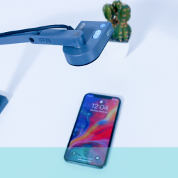
A survey of 1000 UK smartphone users revealed that 29% had made a purchase using the mobile web, in the previous 6 months. With this figure only set to increase, does your site offer effective mobile usability?
This presentation offers advice on the low-down, nitty-gritty aspects of usability, drawing on our own experiences of testing, to give you 5 tips that will aid in improving the user experience of your mobile product.
1. Scrolling
One of the key things we look for when mobile usability testing, is the ability to easily navigate the screen, without frustration or confusion. We have found that too much scrolling can lead to the user getting lost.
- Keep it simple, and don’t clutter screen estate with unnecessary features
- Limit scrolling to one direction only
- A single column layout works best with mobile
2. Anchors
The ease-of-use nature of mobile makes it all the more important for quick access to the various elements on longer pages. One suggestion we make is an anchor link at the top of page, which will jump to the footer, where the sub-headings are listed, which, in turn, are anchored to the corresponding areas of the page.
- Ensure the anchors jump to the correct sub-heading, regardless of screen resolution. We found this not always to be the case
- Avoid confusion by making sure the anchor text matches the sub-heading text
3. Header
Avoid taking up a considerable portion of the screen with your header. We have seen clients throw everything at it, even the kitchen sink. That meant oversized branding, search bars, ‘Find a store’, contact details, all cluttering up the ‘before the fold’ screen estate.
- Ask yourself what really needs including in the header. A search bar can be useful, for quickly finding a product, but not at the expense of usability
- Keep the design lean, and clutter-free
4. Images
Often overlooked, is the problem of images. To improve mobile usability, these must be resized to suit the screen upon which they’re displayed. Otherwise they take up too much space, and lead to ugly repositioning of other on-screen elements. Responsive Web Design is one way of doing this automatically.
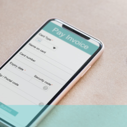
5.Trust
It’s a big commitment for users to hand over their card details to a complete stranger. This is particularly the case with m-commerce, where security issues remain at the forefront of users’ minds. However, we have found that mobile users love PayPal, offering them a safe, and protected environment in which to make a purchase. Be sure that your mobile site accepts it.
6. Being mobile
Some organisations are not yet providing a good mobile experience. They may have an app, have started to optimise for mobile or be planning a responsive web designed site. They should hurry. People are using mobile now.
To ensure the optimal usability of your mobile sites, and apps, contact us today!


[…] of PC, by the time it gets to a smartphone screen it could be completely unmanageable for the user. Endless scrolling to try and find the right content means users will miss what they are looking for and soon decide […]