
Design Fail – Responsive web design and planning to fail
Responsive web design receives high praise one day, as the white stallion upon which the future of web design is charging to the rescue, and severe criticism the next – you will have read about terrible download speeds I’m sure. The reason there is so much debate is that it is still very early in the responsive web design life-cycle and so examples, good or bad, are few and far between. Nevertheless if you plan to give the approach a go with your own website there are a few mistakes you may wish to avoid.
1. Leave content order to someone else
Using a grid system, responsive web design allows the content that is displayed on a large laptop or PC screen to be displayed on narrow smartphone device, and everything in between. The order with which the content ‘blocks’ are displayed is not a random outcome determined by the CMS, someone, somewhere needs to decide on the order. This is an important strategic decision and the easiest way to mess up your responsive web design is to hand the decision over to someone else.
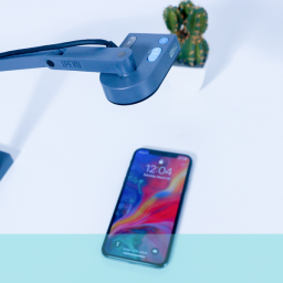
2. Upload big fat images
Responsive web design allows images to resize to fit the screen the website is being displayed on. If you leave your images as great big 1mb files when they are displayed on the smartphone they are going to download very slowly. You should also look to adaptive images as a solution to the download speed problem.
3. Require lots of scrolling
If you have a homepage that requires scrolling when presented on a large screen like a laptop of PC, by the time it gets to a smartphone screen it could be completely unmanageable for the user. Endless scrolling to try and find the right content means users will miss what they are looking for and soon decide that the mobile experience is not worth persevering with.
4. Only go skin deep
With quite a few of responsive web designs now on show the treatment appears to have only gone skin deep. The homepage has been nicely designed with a collapsible menu, nice tidy header, not too much scrolling and then you click through to the next page on your smartphone and ‘boom’. The page expands to fill the screen with microscopic text and a cluster of content in the top right hand corner and wide open spaces to the right and below.
5. Ignore smartphone capabilities
There is great debate in responsive web design and indeed mobile website design circles about mobile or PC first design. Neither approach is correct if you don’t utilise the capabilities of the smartphone. For example a store finder is a very useful multi-channel capability on smartphone or laptop but utilising geo-location on the smartphone adds a degree of value add that is unique to the smartphone experience.
There are plenty of other things you can do that will cause your responsive web design to fail and if you want to learn more about avoiding these user experience pitfalls then get in touch.


Great article. Recommended for every specialist in this field.