For those interested in exactly how and why we apply UX research to the design process to organise a new taxonomy (how we categorise and assign products to various levels within the system) and deliver the ideal navigation system for your users, please download our eGuide, Improving eCommerce Performance Through Taxonomy.
We’ll cover many of the main points in this article, but for a deeper dive into the details, the guide explains everything you need to know in one easy-to-digest document.
Understanding your users to give them exactly what they need
Whether you’re a relatively small, medium or giant e-commerce provider, operate a SaaS platform, or provide masses of content, ensuring a seamless and enjoyable experience means delivering a well-organised and easy-to-understand navigation system.
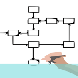
Let’s consider your existing user interface and taxonomy. Who decided how they would operate and what each element—categories and products—should be called? Your design team? Your stakeholders? Your purchasing or marketing department? And how often do you update it to reflect your users’ needs and trends within your industry?
Too many businesses operate on old or out-of-date user interfaces and platforms set up by stakeholders, designers, or marketers, built on personal assumptions and biases. Surely, if the goal is ensuring your users are happy, engaged, and spending (and spending regularly), we should create the system they want while aligning it with our needs.
You might think you’ve got your navigation sorted; after all, you can find what you’re looking for, and if not, there’s always the search bar, right?
Sadly, if the product or process your users are looking for isn’t where they’d expect it to be or is bundled in an area that doesn’t make sense to them, they’ll soon become frustrated and leave your site or app for one that offers them a better and easier experience.
Identifying such issues allows you to create an effective problem statement at the define stage (problem statements are typically created during the discovery phase of our projects) to drive the research and goals required of your system. When done correctly, your goals will drive a better user experience and meet your stakeholders’ needs, including:
- Boosting conversion rates
- Filling data gaps
- Delivering more efficient analytics
- Enhanced SEO and visibility
A well-designed problem statement summarises the key issues and keeps your UX and design teams on the same page, developing potential solutions and working towards the same goals. Ultimately, happier users experiencing fewer pain points will deliver loyalty, increase conversion rates, and improve more about your website and app.
Identifying the Problem
This is where a problem statement shows its value. A UX problem statement describes the issue your team or teams need to be focussed on solving. A great deal of work follows the initial exploration of the problem space, and our UX problem statements ensure that everyone involved understands and sticks to what’s important.
Before we can give our users what they need, we need to understand what we want from them and where we might already be going wrong. These things drive the problem statements we hope will help us achieve our best outcomes.
User research is at the heart of the design thinking process, but we can shine a little light on where, how, what, and why each user pain point happens before we employ any of the various user discovery techniques. To do this, we:
- Review the existing navigation and carry out an audit of all platforms
- Explore analytical data to understand the current user search behaviour better, browse behaviour, the risks of removing or relocating content, and alternatively, the benefits of removing redundant items
- Carry out competitor navigation evaluations and analysis
- Conduct stakeholder research and workshops to understand the business needs
As outlined in our eGuide, we operate a four-stage approach to delivering a new, user-centric taxonomy and navigation system. As you’ll see, user feedback and usability testing are essential to the design process.
- Analytics review—To try to understand current operations.
- Stakeholder and customer research—We run qualitative and quantitative sessions with the target audience and operation stakeholders to see if the user’s problem aligns with the stakeholder’s. We use these findings to create a recommended taxonomy and navigation container.
- Evaluation—We then evaluate the suggested system with the client and propose further user research via A/B testing to tweak and improve its function.
- Governance—Implementing a new navigation system is only half the battle. To ensure clients and their teams adhere to our findings and methodology, we provide a document full of guidelines that help keep the new system scalable should any problem occur after the project is completed.
User Feedback
Customer research provides our essential point of view. Without it, we’re developing any potential solutions based on guesswork and internal biases. User research and feedback provide reliable data on where each problem occurs and how that problem affects the bigger picture.
For improved navigation, quantitative research helps us identify reliable naming and grouping priorities, and qualitative research confirms key groupings and highlights areas of ambiguity.
User feedback also reveals areas of confusion within product naming conventions, misleading category and product applications, and problematic architectures, all delivered through a concise description directly from your user groups.
Usability Testing
Usability testing typically takes the form of open and closed card testing for the initial exploration, followed by A/B testing and tree testing to finetune new prototypes.
Open card sorting allows users to create their own categories; closed card sorting uses pre-defined categories, and with hybrid card sorting, they can add their own categories to those already defined.
Analysing the Problem
Putting the end user front and centre, we can see where those users struggle to create worthwhile solutions. With what we learn from testing (including comparing results from our user research to those of the stakeholders), we reveal the difference between user needs and what we might have considered our initial problem. We then use those findings to build our ideal design solutions: a redesigned navigation flow and an enhanced interface design that overcomes existing layout, menu, graphical, or button issues.
To analyse the testing results, we compare pain points, categories, and naming conventions, using similarity matrix tools to identify patterns.
Impact on User Experience
User Engagement
Imagine you’re an avid footballer, and you need some new boots. If you went into your local sports store and the football boots were mixed in with golf shoes, running shoes, cricket bats, and basketballs, you’d soon become frustrated trying to find the brands and models you’d need to compare to choose your ideal pair. And what if, when you finally get to the till, the assistant disappears and doesn’t return?
It sounds ridiculous, but a badly organized eCommerce website can be guilty of all those things, and that’s why user experience is so important to making sales. A strong UI and well-designed taxonomy encourage interaction and prevent abandonment, and a thoroughly tested system eliminates the errors that drop sales.
User Satisfaction
A better sports store wouldn’t just have all the football boots together; what if socks, laces, insoles, and boot care essentials were presented with them? Not only would that store deliver a great experience for its customers, but it would also boost its chances of upselling.
Testing and Feedback
UX design is an iterative process. If we don’t continue to test our findings and the changes within our target audience, we’re not adhering to an ideal UX philosophy. A user problem requires a user solution, and that’s why testing and feedback at every stage—including after the new UI and navigation launch—are such an important part of the design thinking process.
Implementation of a step-by-step plan – a UX24/7 case study
We’ve spoken about the types of testing that deliver the best results for navigation design: card testing, A/B testing, tree testing, etc., and how they work, but to show you exactly how they impact the needs of our clients, we posted a case study, UK eCommerce retailer mega menu redesign, to show how much value this system delivered to one of Europe’s leading electrical retailers.
With its fast-moving and ever-evolving eCommerce site, the online team at currys.co.uk wanted to ensure that it could accommodate consumer behaviour changes, a growing product base, additional categories, promotions, and more.
In the case study, we explain how we worked from brief to delivery, the proposed solutions that would improve flow, and how we redesigned the navigation structure for greater UX, offering immediate returns. Visit the page to explore our methodology and the successful outcome and results.
Conclusion
A UX problem statement can help UX designers and researchers stay focused on solving problems and achieving their predefined goals. Putting users front and centre ensures we design worthwhile solutions for those using our products and not just feeding the needs of your stakeholders.
To achieve the desired outcome of higher levels of customer satisfaction, increased conversions, sales, ROI, and an improvement to the site SEO, your users are the key to understanding the root cause and creating the systems and platforms they really want.
Our user research experts are available to help you get closer to your customers. If you would like to arrange a no obligation call, get in touch by emailing us at hello@ux247.com or share your requirement using the form below.